The Brief
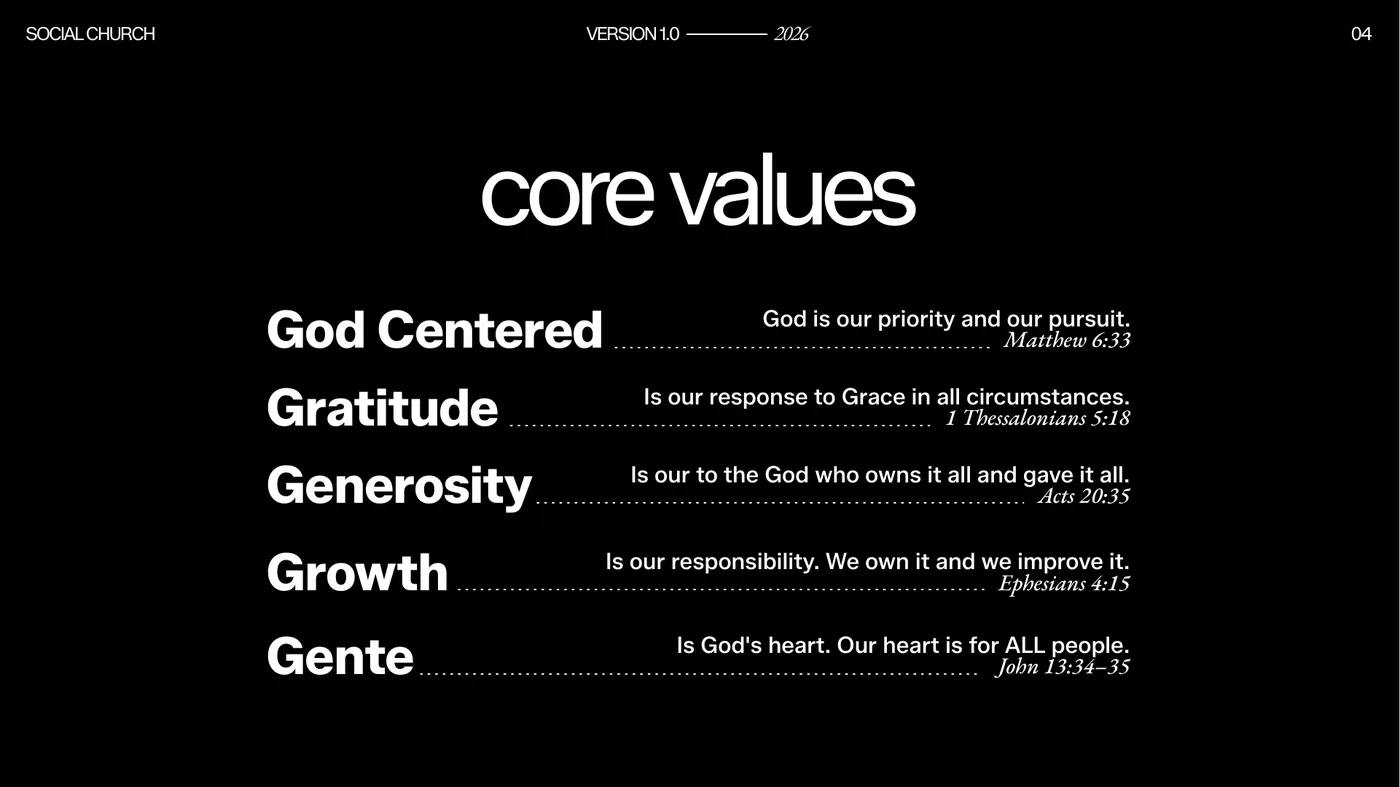
Social Church was getting ready to launch. They had the important parts already nailed down. A name. A mission: build relationships that point people to Jesus. Five core values they actually live by. What they didn't have was a look.
A launch is unforgiving. The brand has to show up everywhere at once and hold together. Signage out front. A shirt on a volunteer. A connect card in a first-timer's hand. A logo small enough to read on a phone. They needed one mark and one system that could do all of it without falling apart. And it's a bilingual church, so the work had to speak Spanish and English with the same warmth, not treat one as an afterthought.
The Mark
It started in a sketchbook. Dozens of routes for the "SC" before one held up.
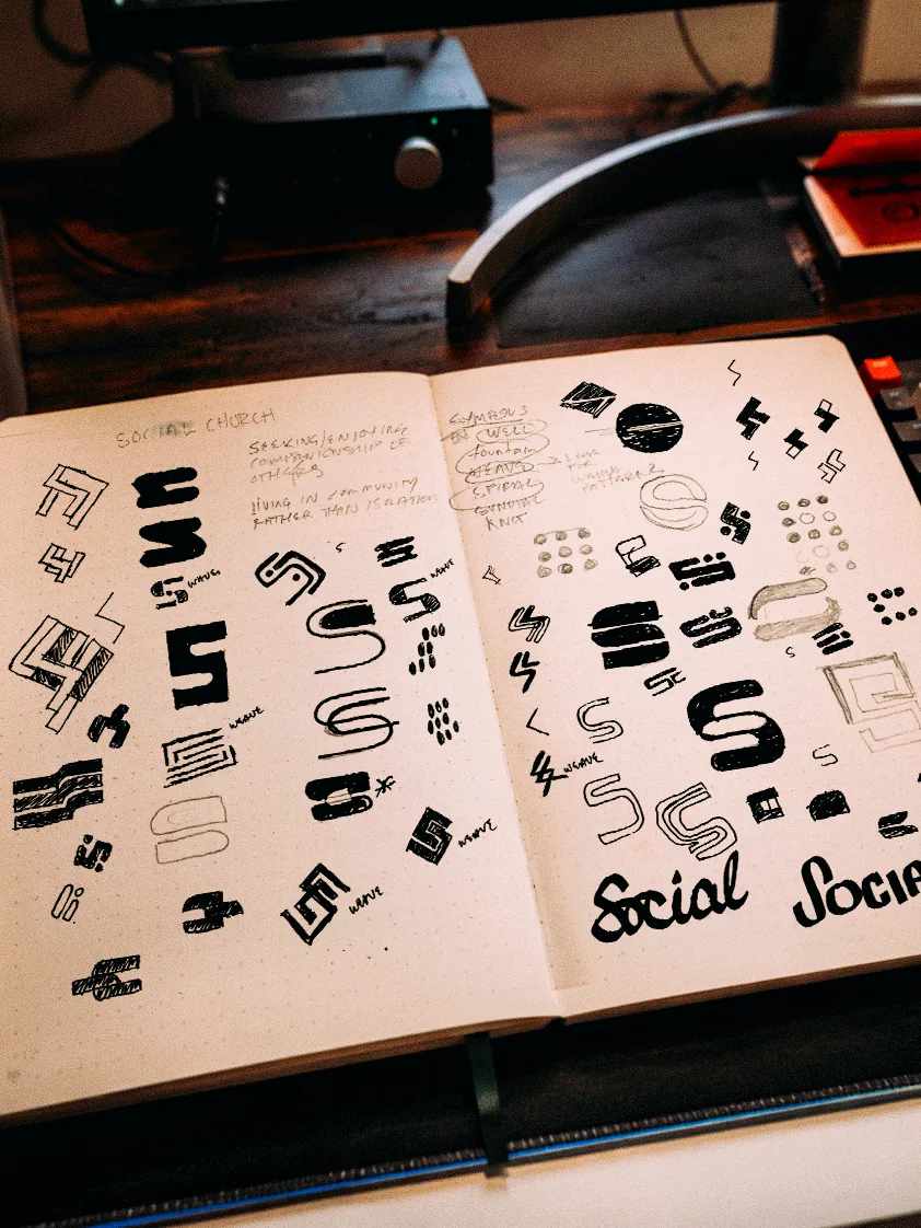
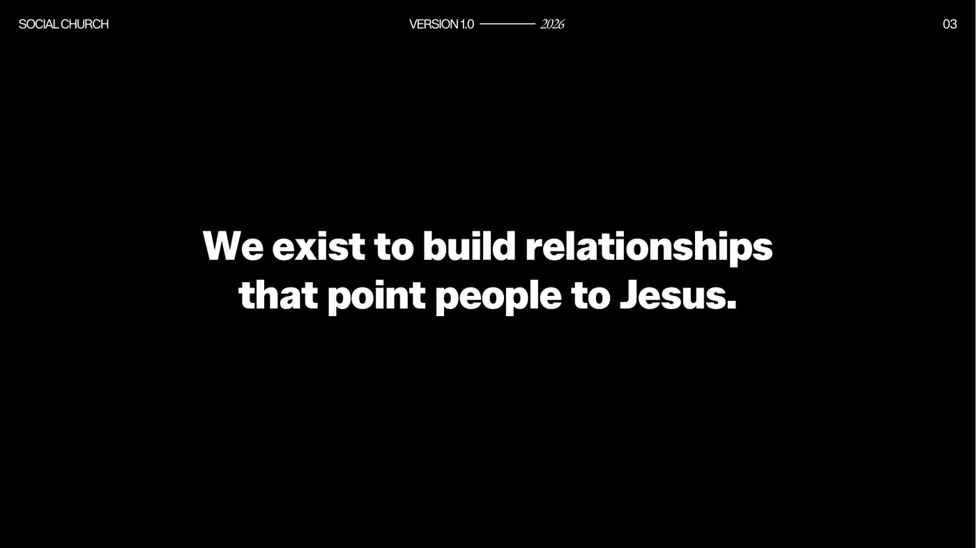
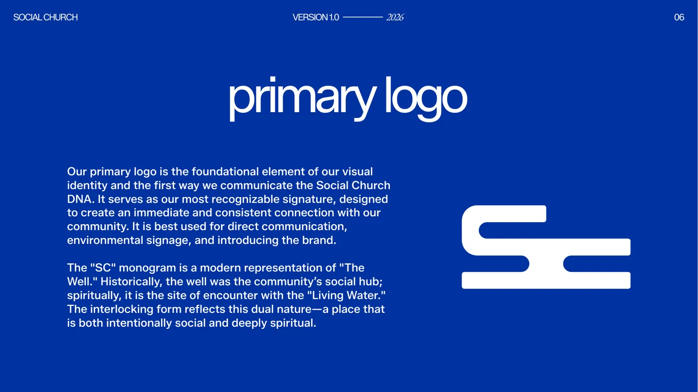
The one we kept reads as two letters and one object: a well. Two bars lock into each other like stone and water. That isn't decoration. In John 4, Jesus sits down at a well and offers a stranger living water. The well was the place a town gathered to talk and to draw what kept them alive. Social and spiritual, same spot. That's the whole idea of the church, so it became the whole idea of the mark.
There's a second layer for a bilingual congregation. The way the two bars interlock pulls from the woven patterns in traditional Latin American cloth, where separate threads cross over and under until they hold as one piece. That's the church's word for itself: people woven together in community. The mark carries it without needing a caption.
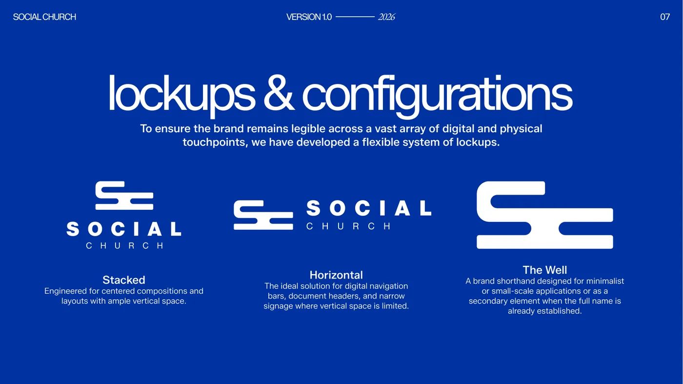
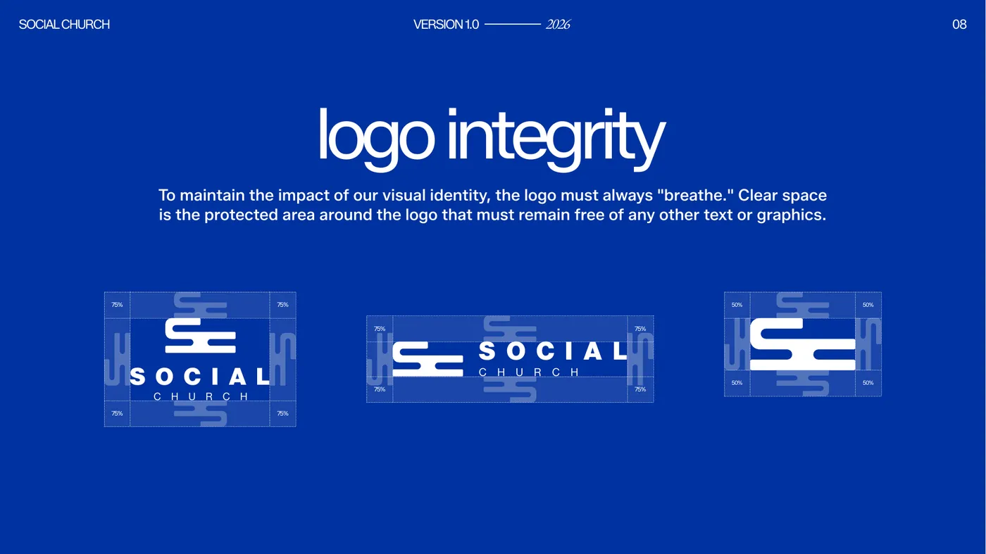
It was drawn one-color first. Solid white, no gradients, no thin lines that drop out at small sizes. Then it was built into three lockups so it never gets stretched or crammed to fit:
- Stacked for centered layouts with room to breathe.
- Horizontal for nav bars, headers, and tight signage.
- The Well, the monogram on its own, for the small stuff once people know the name.
Visual Language
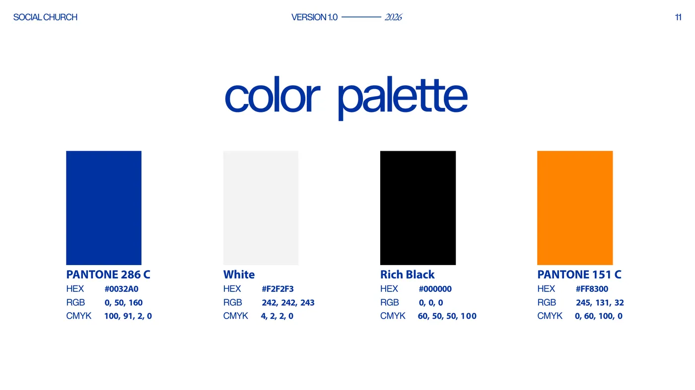
The mark sets the rules and the rest of the brand follows them. Everything got rounded. Corners, counters, the ends of every bar. Nothing sharp, nothing cold. The shapes stay simple geometry, circles and bars and the interlock, repeated into pattern the same way the threads in the logo repeat. Color stays loud and saturated on purpose. Deep blue, hot orange, black, and a near-white, with no muddy middle tones. A church for everybody should look awake, not beige.
The System
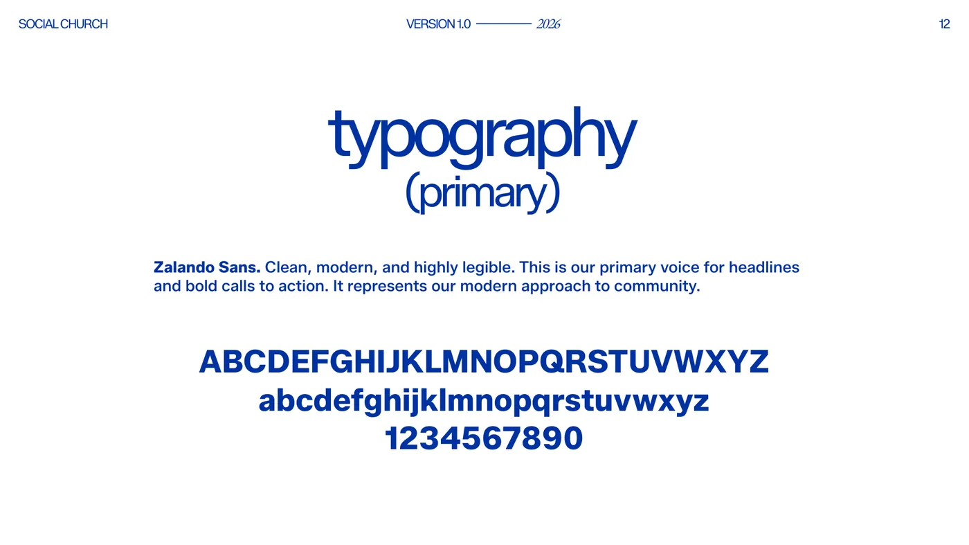
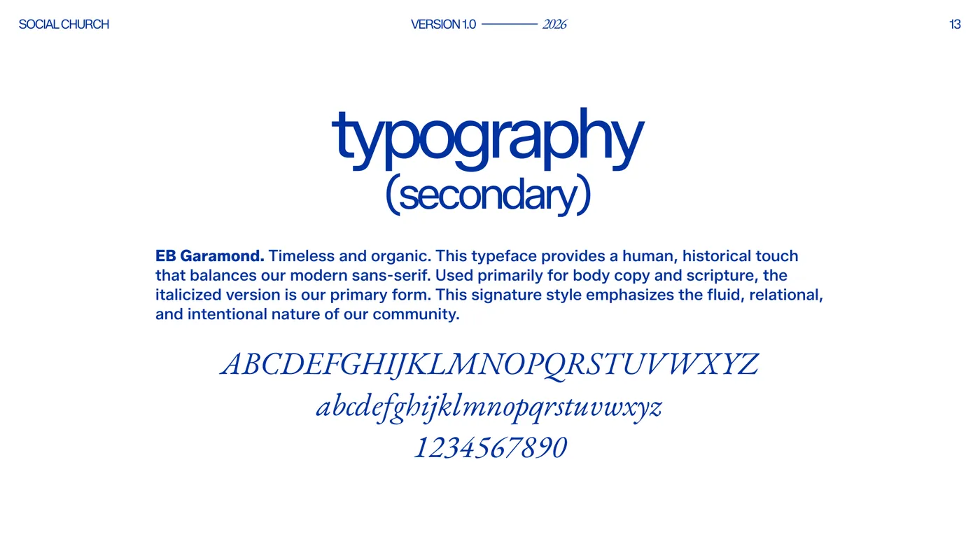
A logo isn't a brand. The system is what keeps it consistent when ten different people are making graphics. Two typefaces do the talking. Zalando Sans for headlines and anything bold. EB Garamond in italic for body and scripture, which gives the modern sans a older, human counterweight. Four colors, locked.
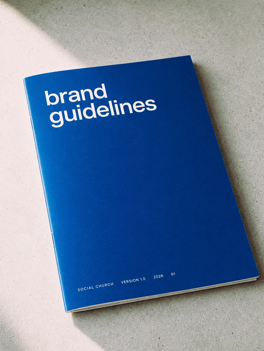
All of it got written down. A real manual, so the brand survives past the launch and past me.
For All People
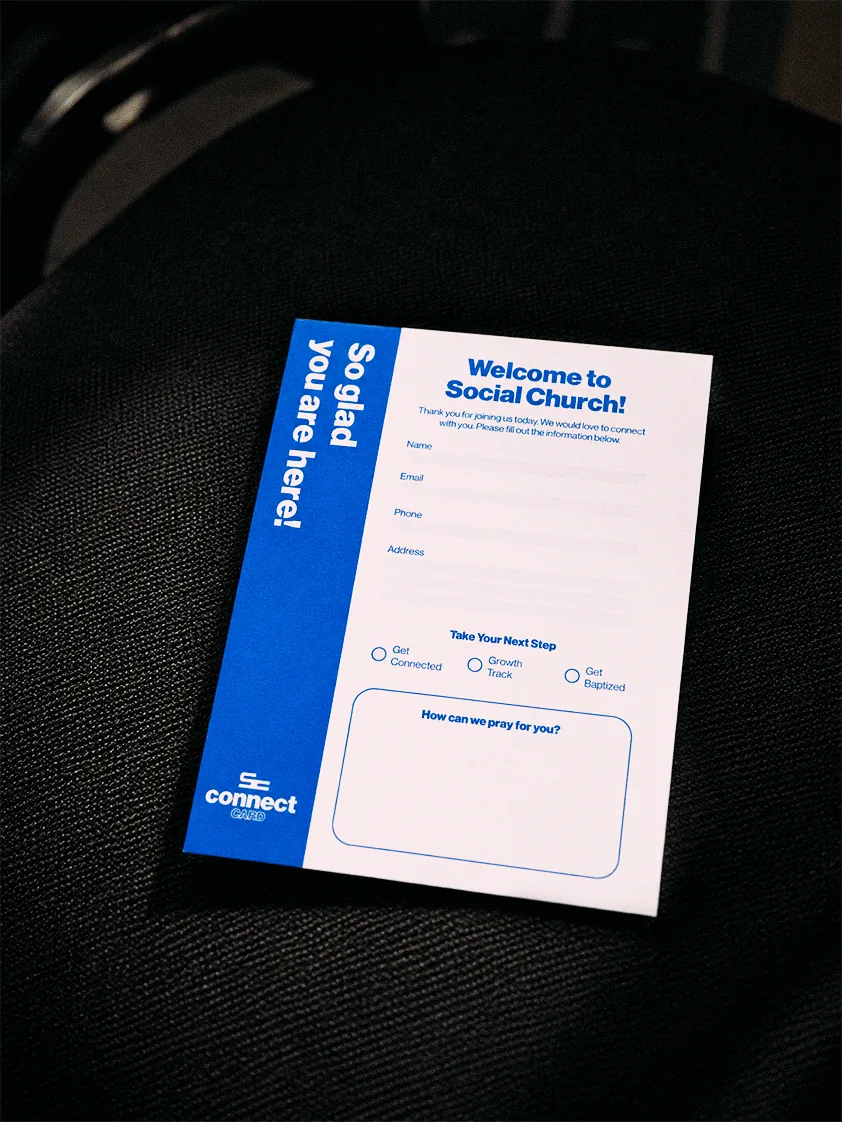
One of the five values is "Gente." Spanish for people. The heart is for everyone, so the print had to speak to everyone. The connect card was built in English and Spanish from the start, not bolted on later. Same card, same warmth, two languages.
Out In The World
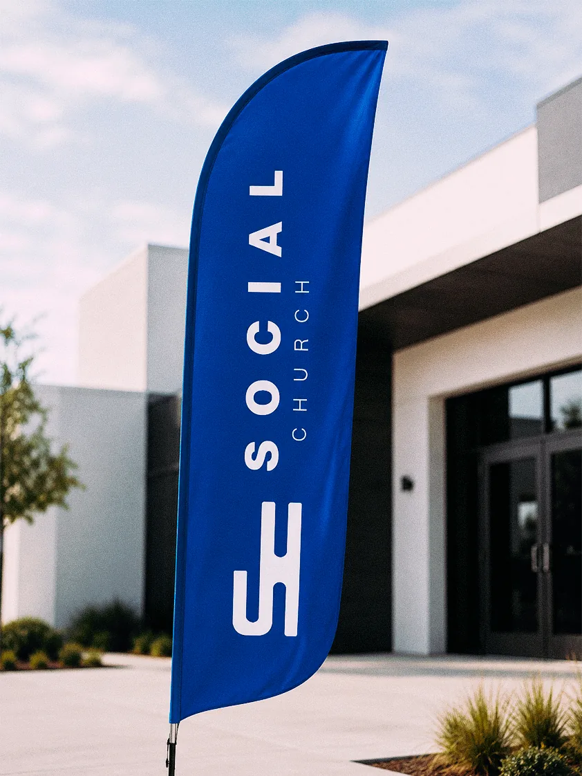
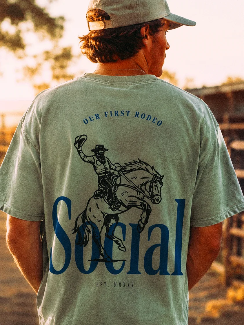
The test of a brand is what it looks like off the screen and on the ground. A feather banner at the front door. A launch shirt people would actually want to wear, leaning on the worn, vintage Western look this valley already loves. "Our First Rodeo" on the back, the wordmark out front.
The Brand Manual
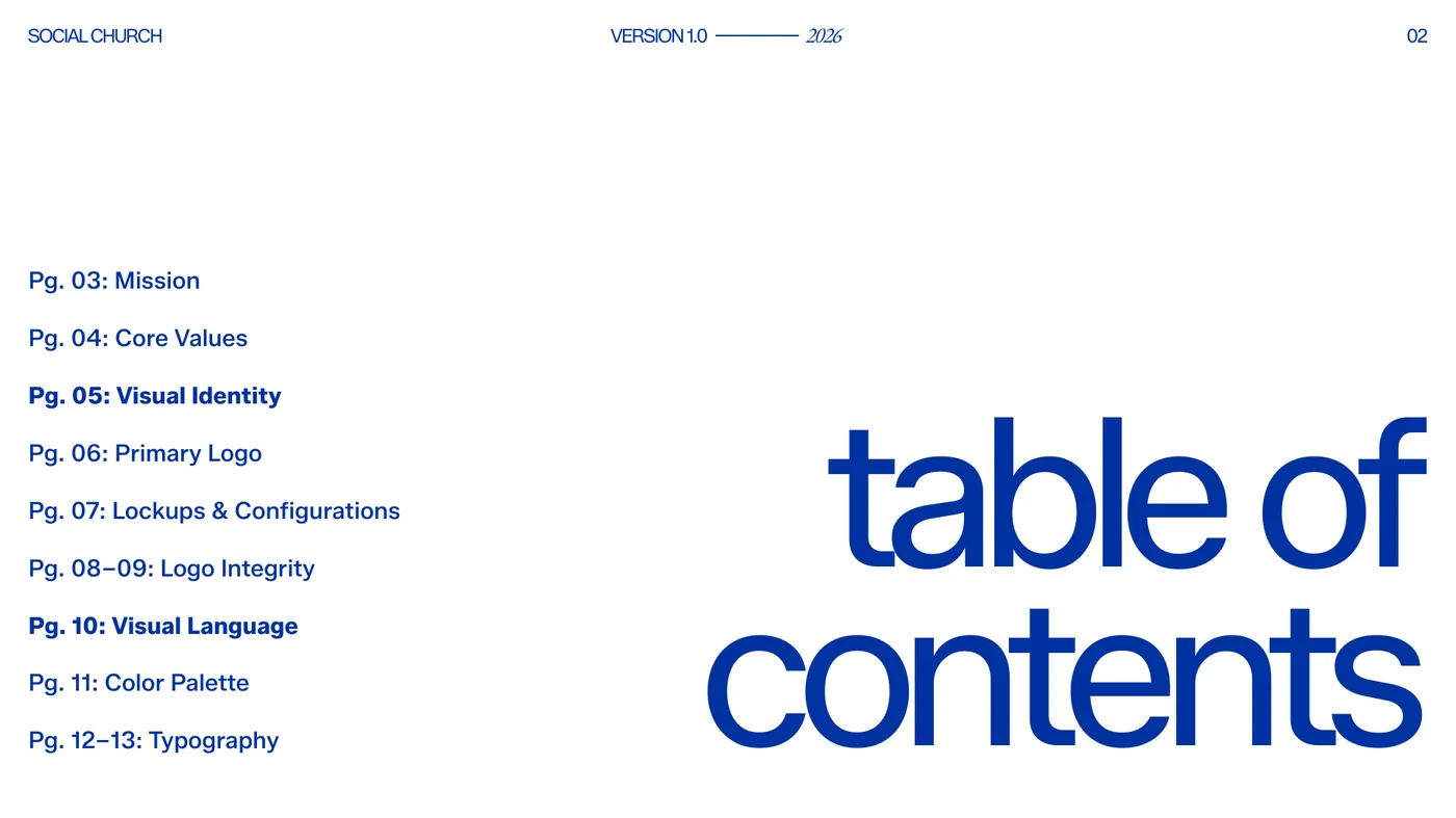
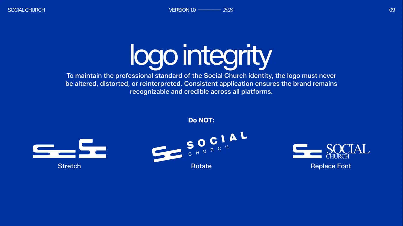
None of this holds without a rulebook. The full Social Church brand manual lays out the mission and the five values, the logo and its lockups, clear-space and the ways you don't get to use it, color, and type. Here's the whole thing, front to back.

The Outcome
Social Church launched with a full kit, not a logo and a prayer. Mark, lockups, color, type, signage, bilingual print, and apparel, all pulling in the same direction on day one. The mark holds at two inches and at twenty feet, in one color or four. The manual means it keeps holding without me in the room.
"Julio is such a professional creative with a heart to understand and capture the vision and bring it to life."
— Fernando M., Lead Pastor & Founder, Social Church
Need a brand that can carry a launch? Start a project →