Case study 004 · Brand Identity
Less Badge, More Business
- Job no.
- BCM-CS-004
- Client
- AZ Garage Floors
- Discipline
- Brand Identity
- Dates
- 2024–2025
- Scope
- Three comps, a fourth from their feedback. Final mark in vertical and horizontal lockups, full colour and mono, light and dark, reference guide
- Status
- In use
Problem
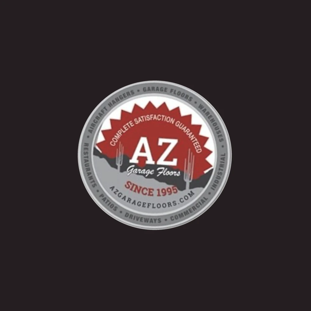
AZ Garage Floors has been doing floors in Arizona since 1995: garages, driveways, patios, warehouses, restaurants, aircraft hangars. Their logo was trying to say all of it at once. A badge with a sunburst, a guarantee, a script name, a mountain range, two saguaros, a web address and eight services around the rim. It was hard to read and it looked dated. They wanted to look like what they are: reputable, reliable, professional.
Thinking
There was one competitor in their market that looked premium, and that set the bar. But they were clear that looking polished could not cost them their personality. So we brought three comps, all of them blue collar and rugged. They told us what they liked in each, and the fourth was built from that: more minimal than any of the three, down to the state, a saguaro and the name.
The rollout ran in two phases. They had just printed a run of collateral in their old red, so phase one kept the red and changed the mark. Phase two moved the palette to terracotta.
Outcome
The new mark is on their website and their uniforms.
The Comps
Three went into the first presentation. The fourth came out of what they liked in each.
Before / After
What they had, then the two phases. Same mark in both; only the colour moved.
In Use
Where the mark has to hold up: a shop sign, a work van, a polo.
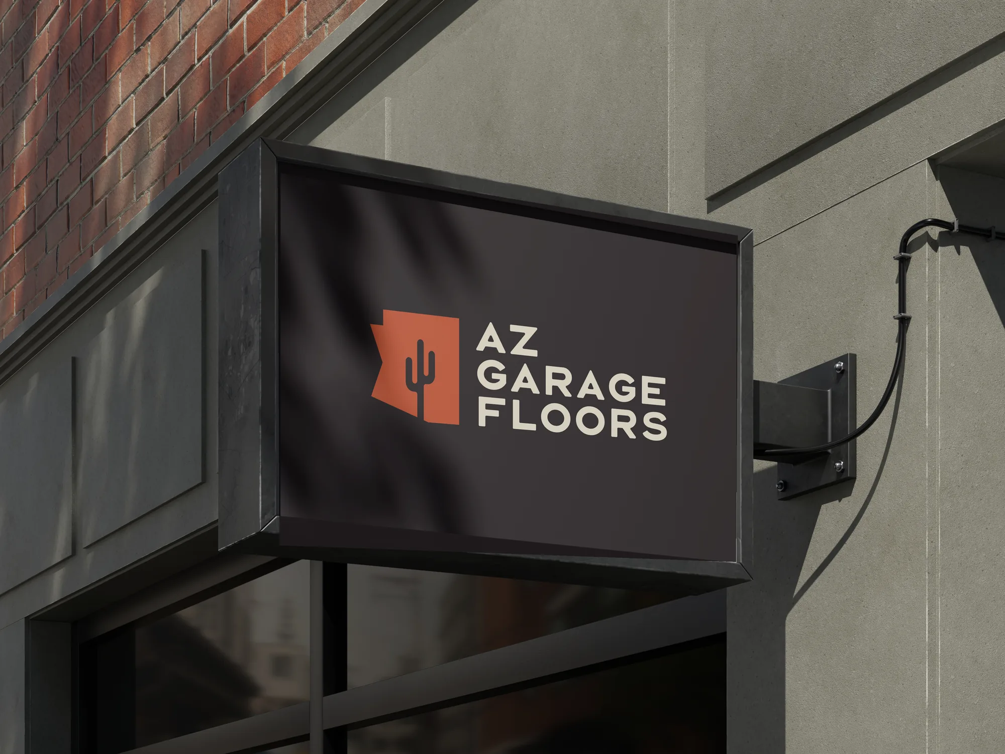
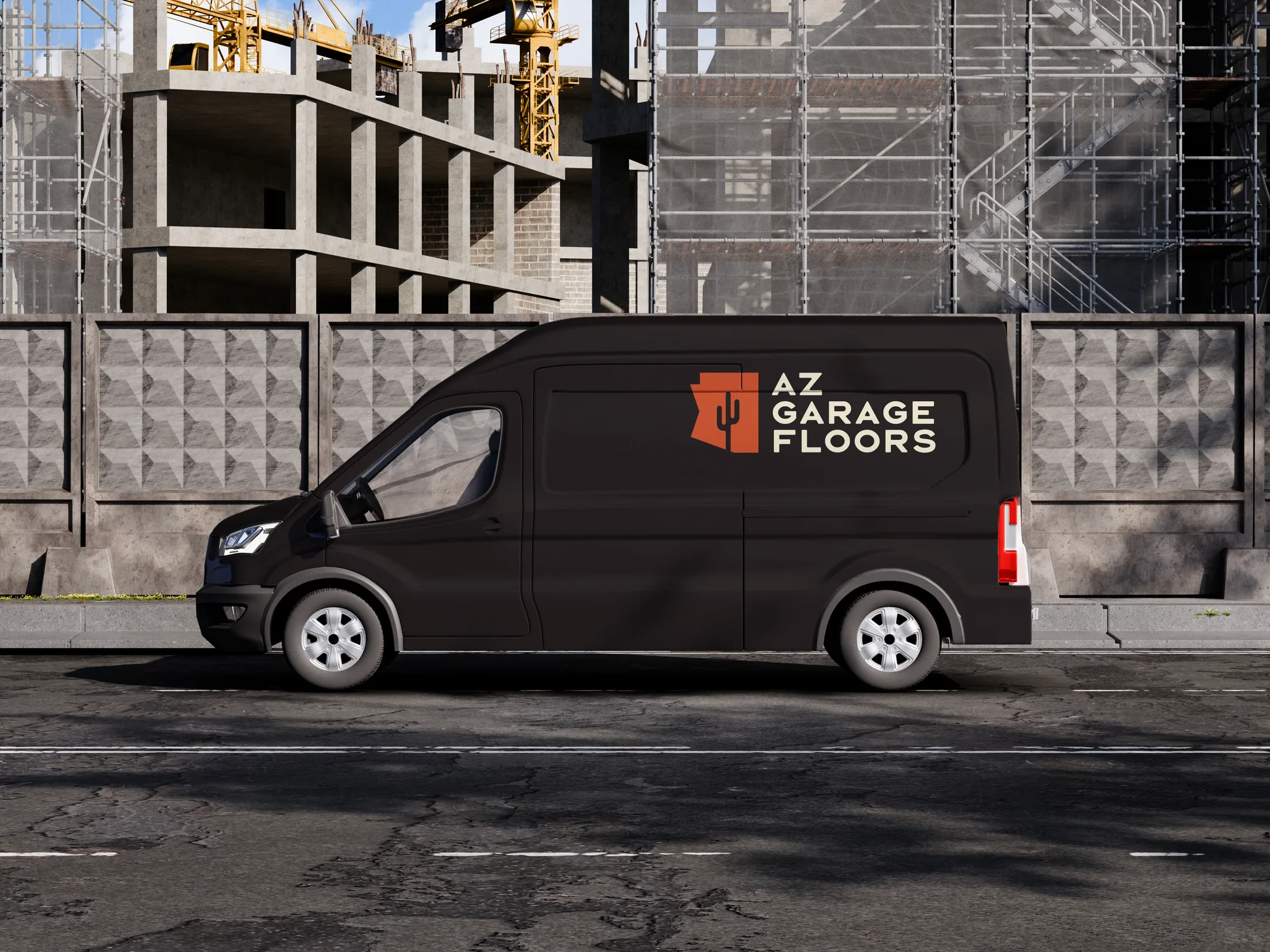
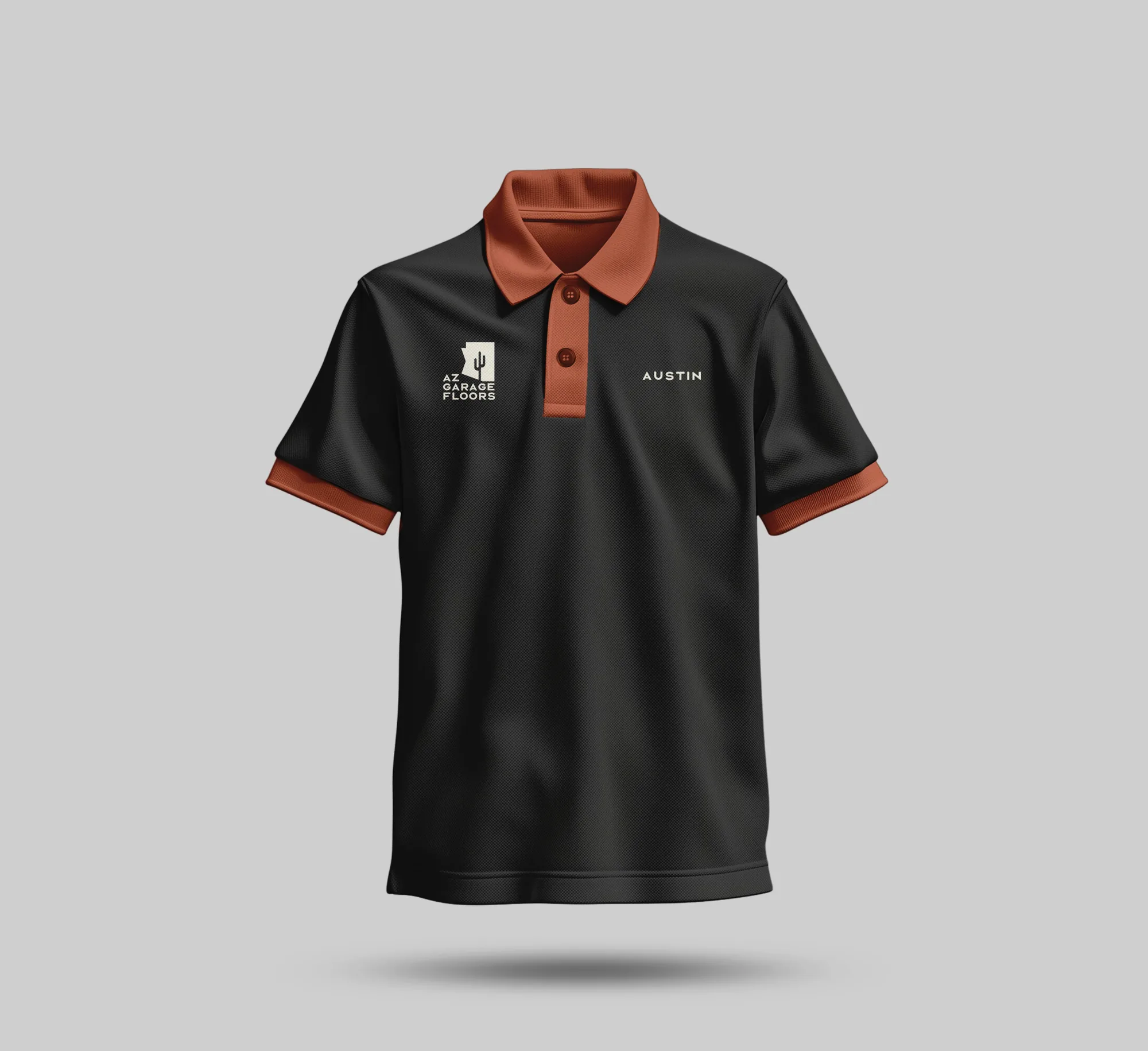
Mockups, not installs.